Work
Helping brands attract and delight their ideal customers
Testimonial
Ian Mackinnon · Mackinnon & SaundersWe are delighted. Club Studio’s service from start to finish has been exemplary and highly professional.
Mackinnon & Saunders
We designed and built a brand new, Craft CMS-powered, responsive website to give this client complete control over their marketing website and its content.
Lease4Less
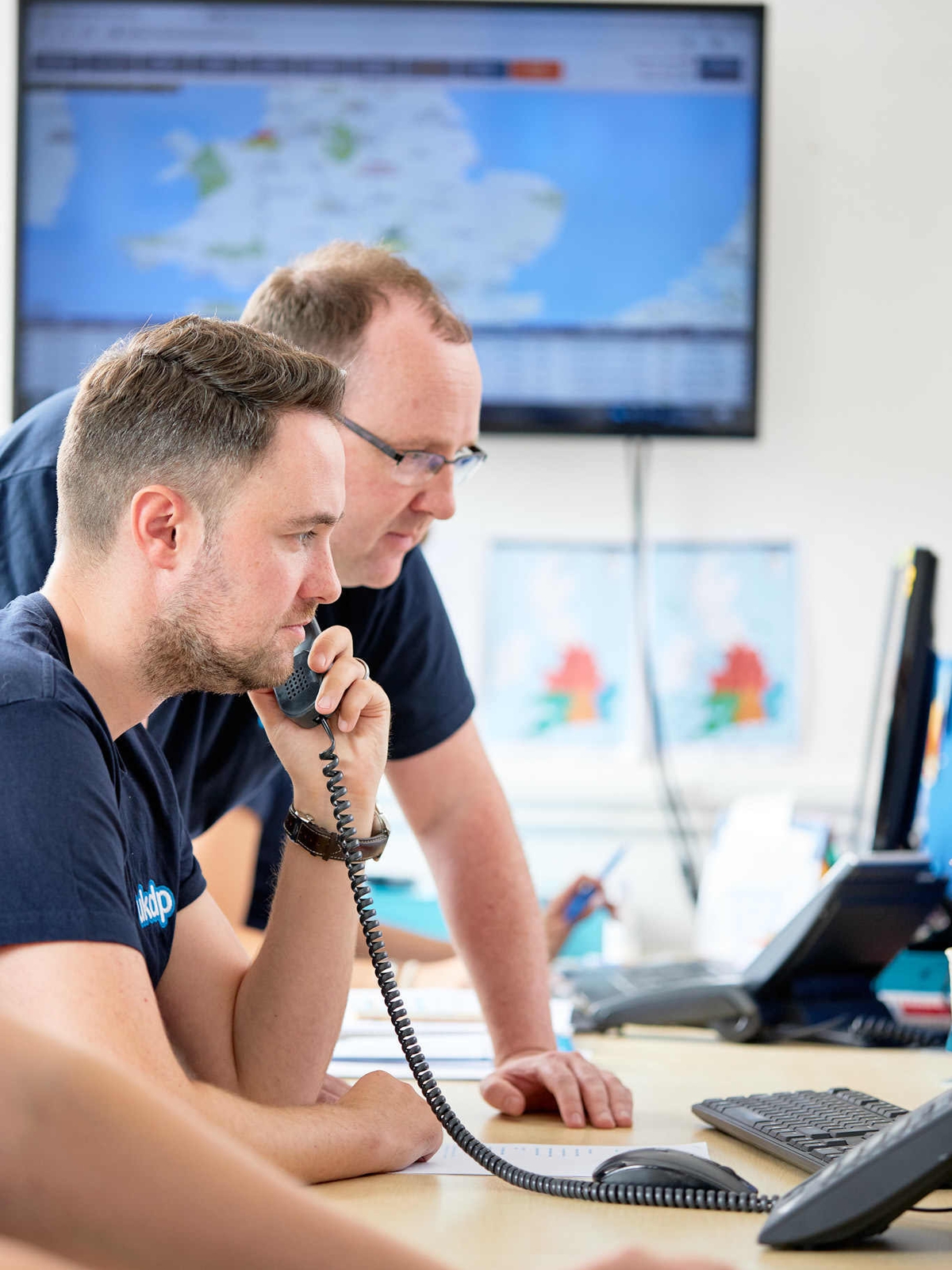
We worked with the team at Lease4Less to create a bespoke CRM system that handles the entire car leasing process—from initial enquiry to delivery of the vehicle.
Green Economy Coalition
We worked with the Green Economy Coalition team to evolve their Craft CMS-powered marketing website, helping them to reach a wider audience and making a meaningful difference.
Tailored Fire & Security
To help elevate the TFS brand, we refined their existing brand identity before designing and building their new CMS-backed marketing website.
Far & Wild Travel
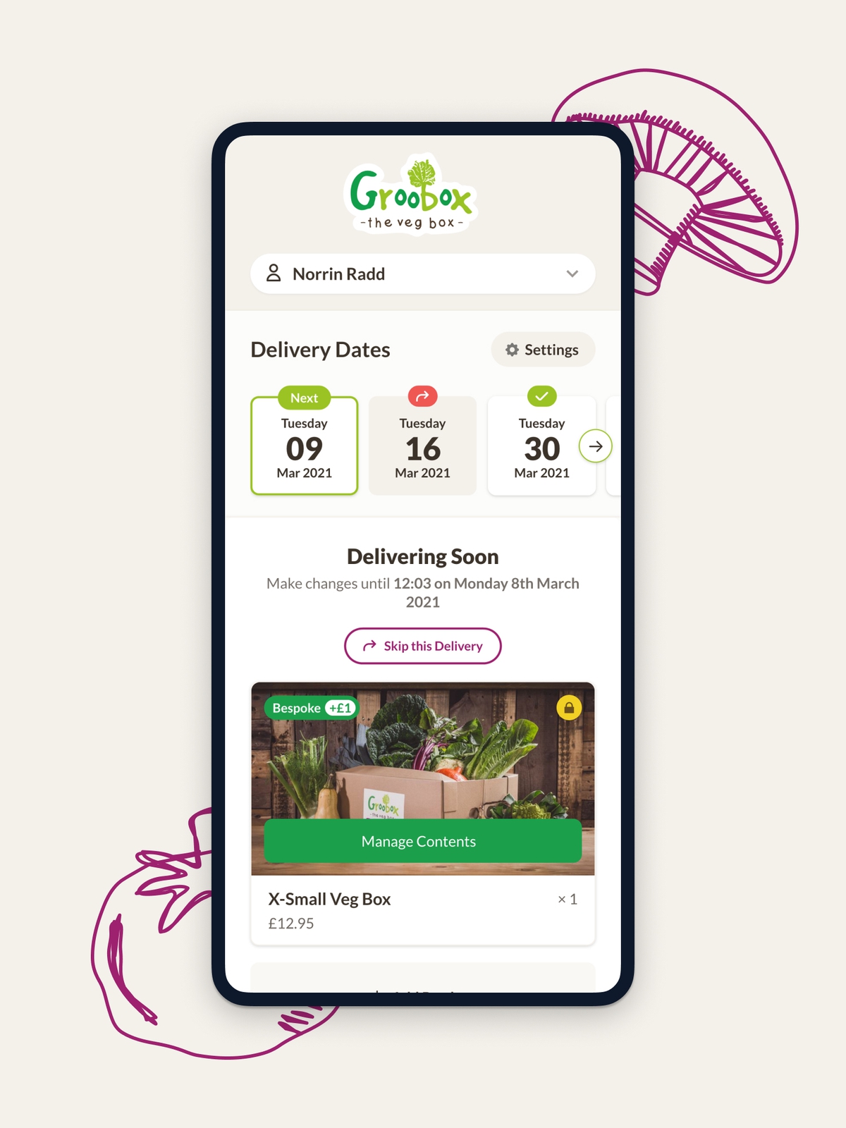
We helped bring the Far & Wild Travel brand to life with our brand strategy and branding services. A Craft CMS-powered marketing website and a fully bespoke CRM application soon followed.
BuyAssociation
BuyAssociation needed a way to manage their property portfolio across their extensive network. We provided custom software to help them do just that!
IDAHO
We helped this Altrincham-based bricks and mortar store start selling their carefully curated products online with a Craft CMS-powered e-commerce website.
Miss Selfridge
Our UX/UI design services helped Miss Selfridge avoid losing sales on their e-commerce website by refining their existing checkout flow.