Using user data to inform design decisions
How to use real user data to help guide design decisions during web projects.
It’s important that what we do makes a real difference. And, as part of that, we use data to help guide decisions during projects.
Often the data is extracted from tools such as Google Analytics and Google Search Console to provide an insight into:
- The top performing website content
- The most common user journeys through the website
- The pages most likely to result in goal completions/conversions
- The most visible content on search engines
- The content most likely to generate clickthroughs from search engines
- The pages that are responsible for the highest bounce and exit rate
The words ‘data-driven’ might not set excitement levels soaring. In fact, most would associate the word 'data' with the word 'dull'. And there's also often a misconception that 'data-driven design' forgets human nature in favour of cold statistics - let’s dispel that straight away.
Data shouldn't inhibit creativity or replace intuition. It should be used to aid decision making as it provides a real insight into how visitors are using your website or web app.
It’s so valuable yet so often overlooked.
Data exists to support you
In most cases, data will serve to support intuition. The benefit of that is twofold; designers receive validation (and an ego boost?) and clients are reassured.
Inevitably there are points during any project where the data we gather contradicts our initial thinking. Maybe we thought we knew what the top-level links in the navigation should be, only for the data to suggest that we need to revise that.
It’s findings like this that need to be flagged up as early as possible because getting the structure right from the off saves time, money and resources by not having to make extensive changes or revisions further down the road.
We learn from the data and use it to shape ideas.
Data doesn’t need to be complicated
Data-driven design doesn’t have to be complicated. All of that knowledge you left behind in maths class isn’t going to come back and haunt you. We’re not talking formulas or spreadsheets with a dozen functions. All we’re doing is extracting and collecting data and then visualising it one place. Quantitative data that provides insight.
So now that we’ve debunked a couple of myths surrounding a data-driven approach, let’s discuss how we actually go about putting it into practice.
Using data is particularly effective in the context of a website redesign. You’ll likely have an abundance of existing data to serve as a starting point, which is great!
All of that knowledge you left behind in maths class isn’t going to come back and haunt you.
Unless you are repositioning or rebranding, a website redesign is often needed because the existing site is failing to effectively communicate your offering.
If we fail to understand why that is, we risk making the same mistakes again and fall into a cycle of frequent, costly redesigns that continue to see visitors needs go unmet.
How do we avoid this? Yep, you guessed it, data!
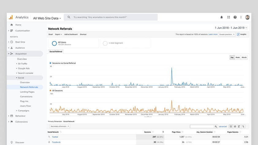
If you have analytics tracking software such as Google Analytics or GoSquared, we can use this to evaluate the existing website during the content strategy and UX/UI design phases.
We start by drilling into visitor behaviour; including how visitors get to the website and how they interact with it once they arrive. Without this understanding, we risk making decisions that are not in the best interests of the visitor.
For example, we might wrongly demote highly-visited content and mistakenly prioritise information that isn’t helping the visitor at all.
Whilst you can make semi-educated guesses without it, nothing beats having real user data to help guide important choices.
Conducting a content audit
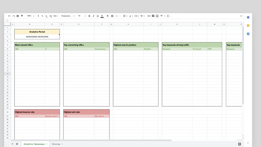
A content audit helps to evaluate the existing performance of every page on the website.
We look to the data to highlight information - such as the most popular areas of the website, the pages that contribute to the most conversions, or the pages that are failing to prompt visitors into taking any further action.
When evaluating how visitors get to a website, it is useful to have a spreadsheet that contains a list of all the existing pages along with the impressions they generate, the average clickthrough rate and where they rank in search engines.
This information helps to identify the most effective pages on the current site that attract visitors and ensure that they remain well signposted on the new website.
Using data to inform sitemaps and user flows
A sitemap is an invaluable asset when creating a website.
It helps map out the structure of a website before heading to the wireframe phase. In the context of a website redesign, we’ll produce two sitemaps. One for the existing website and one for the proposed new design. Again, we use data to inform how the new sitemap should be constructed by evaluating the failings of the current sitemap.
Here’s a good example...
Working on a recent project, during the data collection phase, we discovered that when a visitor landed on the homepage, the page that they were most likely to visit was the Meet the Team page. This was despite the fact that the link to Meet the Team didn’t appear on the homepage directly - instead, it was nested in a dropdown menu in the main navigation.
With the help of the data, we decided to give greater prominence to the team on the homepage. Without referencing the data, we would have missed the opportunity to quickly present visitors with content they were likely to already be looking for.
Harnessing the power of A/B Testing
One powerful way of using data to drive design decisions is the use of A/B testing.
A/B testing involves comparing two variations of a design to determine which performs better. You could choose to A/B test an entire page or even a single component such as headline copy or a button to see which version performs best.
For example, if you have chosen to A/B test a web page that contains a particular call to action, visitors would see one of the design variations at random and you can use the data collected to establish which design gets the most clicks. You can then make an informed decision about which design to focus on and use long term.
As well as having a goal in mind during an A/B test, it’s useful to construct a hypothesis - why is variation B going to perform better than variation A? We can then put that hypothesis to the test and see if our assumptions on the best user experience are correct.
Making the case for iterative design
There is a great deal of value in getting it right the first time both for you and your visitors.
Data-driven decisions are closely aligned with ‘iterative design’ - a methodology that encourages changes, updates and feature releases to happen at a steady, consistent pace. Think, little and often.
Until something is launched, we’re at risk of making decisions based on faulty hypothesis or misguided assumptions. You don’t want to spend months designing and developing a website only to discover that it's ineffective.
An iterative approach makes it quicker (and more cost-effective!) to change course if the feedback and data says it's needed.
Data makes it much easier to move beyond far-reaching, frequent redesigns and instead towards an iterative design approach. We would much rather take an already successful website and continue to refine, analyse and optimise it over time than completely redo it every few years.
This also makes the experience for visitors more familiar as changes are less drastic. Their experience is steadily improved rather than them being faced with a completely different looking website or web page in an attempt to see what sticks.
Summary
Although we try, we can’t always accurately predict exactly what a visitor wants.
To properly understand this, we need to gather data and distil it into actionable insights. We can then use the insights to deliver an experience that really resonates.
Using data, we make fewer assumptions and more informed decisions.
And, to us, that's pretty exciting!