Choosing the right typeface
The right typeface can be the difference between a delightful user interface and a frustrating one - here's how to choose the perfect one.
Typefaces are important. They set the tone. And they can be the difference between a delightful user interface and a frustrating one.
In this post we’ll explore the process we go through to choosing the right typefaces, including:
- Selecting a typeface this is versatile and readable
- What to look for when selecting a typeface
- How typefaces impact the performance of a website
- Considering the flexibility of typefaces
Before we dive into how to go about choosing the right typeface, let’s first clarify what the difference between a typeface and a font is - since they’re used pretty interchangeably these days. A typeface is the collective name given to a family of fonts such as Times New Roman or Helvetica. Within a typeface, you might have several different weights or styles - each of which would be considered a font (Helvetica Condensed, Helvetica Narrow, Helvetica Narrow Bold etc…)
For the purposes of design today, particularly on the web, the terms typeface and font have largely come to mean the same thing - and whilst that might irk some, we don’t think it’s worth losing sleep over. 🙂
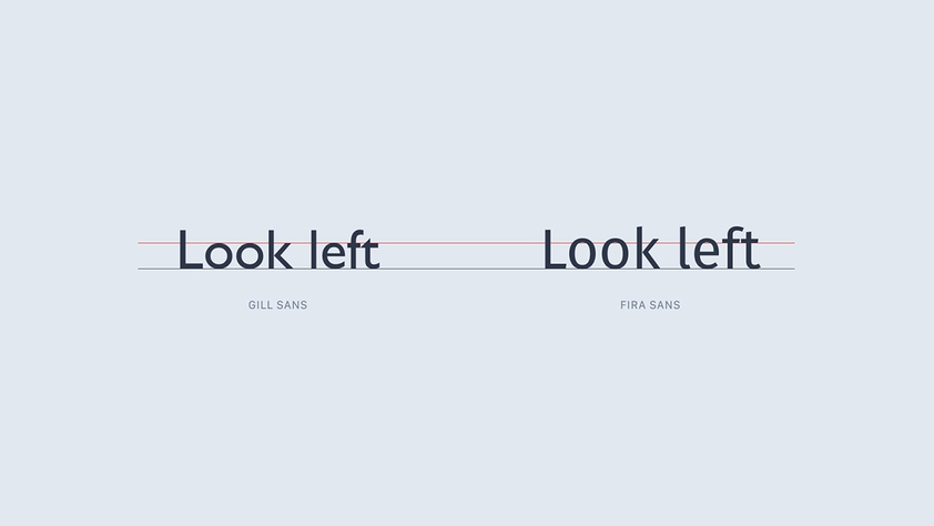
Is it readable and versatile?
These are often cited as two key criteria when choosing a typeface.
It’s also important to use typefaces in the manner that they were intended - use display typefaces for headlines and body typefaces for body copy etc.
Beyond the style of the typeface itself, there are several decisions we can make that influence the readability of a typeface, including the spacing between letters, the line height, colour contrast and letter casing.
If you’re only using one typeface or the website is particularly text-heavy - having access to multiple weight and italics is useful. Because it still allows you the design freedom to create a website that has a cohesive layout, a clear hierarchy and is easy to navigate - all without using multiple typefaces or needing an abundance of other visual elements. It’s often a good test of a typefaces ability to see how it fairs when all the noise is stripped away and it is the only element present on the page.
Consider the x height
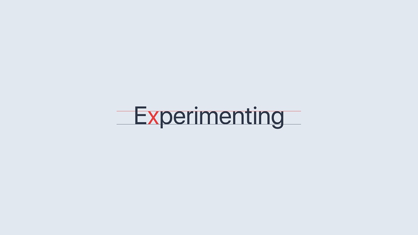
When determining the legibility of text, beyond the ‘eye test’ we can refer to the ‘x-height’ of the typeface. X-height is the height of the lowercase x character, measured from its baseline. It’s generally considered that a larger x-height makes for more legible text. There is a balance to be struck however, if the x-height is too large, this can reduce the legality of the characters - as it becomes harder to identify the shape of each word if every letter is of a similar height.
Will it impact page speed?
If a typeface looks good, but significantly impacts the performance of the website, then it’s time to rethink your choice of typeface(s). It’s important to strike the right balance between aesthetic and usability.
A sure-fire way of slowing a website down is to try and load too many font files. Don’t go overboard. For most projects, we generally use one or two typefaces, each containing two or three font files - often for the purposes of having a typeface available in a couple of different weights and an italic option. Some projects will call for a little more. Others, a little less. But we always keep an eye on how many font files we are relying on and how it is impacting page speed.
For larger projects, particularly where there is a real emphasis on page performance, we’ll even look to use the default system font stack - this can boost performance because the browser doesn’t have to download any font files as the website is defaulting to the pre-installed fonts that are available on the operating system.
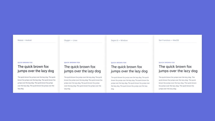
Each operating system (Mac OS, Android etc) defines their own default system font and to illustrate the differences between the typefaces across the various operating systems, we created a little mockup.
From an aesthetic standpoint, the default system stack is now much easier on the eye than it once was - and performance is to become before anything else, then relying on system fonts is no longer the compromise it once was.
A sure-fire way of slowing a website down is to try and load too many font files. Don’t go overboard. For most projects, we generally use one or two typefaces, each containing two or three font files.
Which characters are supported?
It’s important to consider how the typeface(s) you choose will be used not just in the short-term but the long-term too. Typefaces are an extension of your branding and must align with the experience that you want your website to deliver and who you want to reach.
That’s why, when selecting a typeface, it’s important to see how text may look when translated into a different language.
If you want to provide localisation support and you are looking to reach people in multiple countries, then your typeface should look good in multiple languages. Many typefaces do support multilingual text, but it’s important to double-check.
Summary
Choosing typefaces is a crucial part of any design project. Regardless of whether we’re designing a customer-facing marketing website or an internal web app, a good typeface should be readable, versatile, flexible and have the least impact possible on performance. Typefaces not only set the tone but they go a long way in determining the overall user experience.
During the design process, we’ll compare, contrast and test-out dozens of different typefaces in order to decide which will be the best fit.