7 ways to improve your website's forms
Often the most common method for lead-generation for your brand, let's make sure your website's forms are spot on.
Forms are important. They are one of the most common methods for lead-generation for a brand. This makes it all the more important to deliver a good user experience and make sure they are intuitively designed.
In this post we’ll explore some of the techniques you can use to improve your forms and boost conversions. Through a combination of good content strategy and UI and UX design, they should be a breeze (even a joy!) to complete.
Let’s dive in.
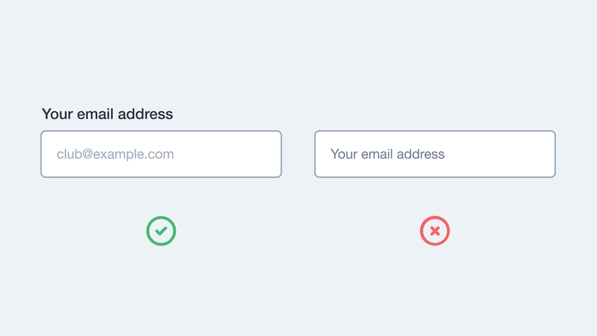
1. Avoid using placeholder text as labels
In an effort to save space, it can be tempting to use placeholder text as form labels. But this presents both an accessibility and usability issue. As soon as the user has entered their information, they have no context as to what the field is related to, which is particularly jarring when you are scanning the form before sending it. To avoid confusing the user, use clear labels that remain visible at all times.
2. Confirm that the form has been sent
You don’t want to leave a user wondering if the information they have entered has been successfully submitted. That results in confusion, duplicate submissions and potentially lost leads. Redirecting users to a confirmation screen or replacing the form with a thankful confirmation message, is a good way to avoid any confusion. Avoid showing a confirmation message inline whilst the form is still visible - because you can’t rely on a user scanning the page to check that the form has been submitted. They might miss the message, only see the empty form and think all their efforts have been lost!

3. Group form fields into a logical order
If a form is particularly long, you can reduce the burden on the user by breaking the form up into smaller, related chunks. You’re less likely to over-face a user and they can tackle each section - one at a time in a logical way.
4. Show form errors inline
We’ve all experienced this. You submit a form only for it to fail to send and you’re left wondering what went wrong. Avoid grouping form errors and instead show them inline, near to the errored field - that way you’re applying context to the error and you can better guide users on how to correct it.
If a user is required to fix errors in the form, make sure you preserve all of the information that they have entered correctly. Because nothing frustrates a user more than asking them fill out information for a second time!

5. Use the submit button to confirm what is happening
Explain to users what will happen when they submit the form. Rather than using generic terms such as ‘Submit’ or ‘Send’ consider using more descriptive text that is relevant to the action that the user is taking. For instance, if they are reserving a table at a restaurant, your button text might say ‘Confirm Reservation’. Give the action context and relate it back to the user’s reasoning for completing the form in the first place.

6. Pre-fill fields where possible
Take the opportunity to pre-fill form fields where possible. Is your user already logged in? If they are, pre-fill common form fields (like their name, email address and anything else you already know about them). Similarly, if the user is submitting an enquiry about an order they’ve placed, consider showing them a select field that let’s them choose which order their enquiry relates to.
Another good example of where it’s possible to pre-fill form fields is when collecting a physical address. Resources like Google Autocomplete make it quicker and easier for users to enter their address - because all they need to do is enter their postcode.
Autocomplete will then present all of the addresses associated with that postcode. Rather than having to enter their address manually, the user can select the address that is relevant to them. It’s less work for the user and has the added bonus of removing the likelihood of a user incorrectly entering their information.
7. Validate information in real-time
There are times when validating a form in real-time is useful. Typically, users don’t know if they have filled out a form correctly until they submit it - only then will any errors be presented. If you have a particularly lengthy or complex form, providing real-time validation is a great way to improve the user experience. It reassures the user that the information they are entering will be accepted and/or is correct as they go.
This is particularly helpful when filling out payment information. When entering card information, users are asked to select their card type (Visa, Mastercard etc) before confirming their card number. Using real-time validation, we can simplify this process whilst also reassuring the user that their information is correct. This is something Stripe do particularly well.

Summary
So that’s our 7 tips for making your forms easier to use and more likely to convert.
A good form should:
- Avoid using placeholder text as labels
- Confirm that the form has been sent
- Group fields into a logical order
- Show errors inline
- Use the submit button to confirm what is happening
- Pre-fill fields where possible
- Validate information in real time
Forms are an invaluable part of most websites. They are a key source for lead generation so it’s important that they work well. The tips above are a good place to start when thinking about improving the usability of your forms and making life easier for your users.